Year 1 Graphic Design
Color Wheel/Color Theory
Type Animal
Landscape and Cityscape
City College Portfolio: How To
Year 2 Honors Graphic Design
Lettering Projects
I traced 20 different lettering designs using the pen tool
Type Design
T-Shirt Designs
I made 10 different designs for T-Shirts
Logos
9 Logos Initials
Black Logo
3 Color Logos
Project Yellowlight Billboards
These are 3 different billboard designs I made for Project Yellowlight, against texting while driving
Vans Shoe Designs
I made 5 themed designs for the shoe brand Vans and made inspiration boards for each, with their own color pallets included in the design. The five themes were famous, art, animal, element and my choice.
For my first design I made it Spider-Man themed to fit the famous category, since he is a famous, well-known fictional character. I made it red and blue, Spider-Man's iconic color scheme. I made a web stretching out at the top to resemble his webs.
For my second design, art themed, I made it based off Van Gogh's Starry Night. I painted the strokes in illustrator to show the stars, clouds and the moon. I was inspired to use this piece because Van Gogh is my favorite artist
My third design, animal themed, is based off of foxes. I made the shoes orange, white and black resembling fox colors. I added fox ears in a different shade of orange at the top of the shoes.
My fourth design, element themed, is based on the element fire. I made the shoe orange and red to resemble the colors of fire, then designed a cartoonish flame on the side. I colored the flame using different shades of reds, oranges and yellows, as shown in my inspiration board.
For my fifth design I chose the theme of space. I used the gradient tool to blend a dark blue and dark purple to give the shoe a galaxy effect, using the colors from my pallet. I made the laces, inside and bottom black so the nebula colors would be more prominent, I then added tiny white stars to match the theme.
Skateboard Designs
Similar to the Vans Shoe designs I made ten different designs for skateboards and again made inspiration boards for each of them to base off my designs.
For my first design I made it beach themed. I made a small island with palm trees and a sunset in the background. I made the waves different shades of blue and made the middle one in the shape of a heart. I used the gradient tool for the background to make it look like sunset hour and I added birds in the sky.
For my second design I made a cityscape. I made the background buildings a light purple and the more in front ones a darker purple to add a sense of depth. I made a sky with clouds and the sun for the background and for the foreground I made up-close flowers and grass.
My third design is of a cow being abducted by aliens. I made a ufo with a beam lifting the cow on a grass field. I made a starry sky, a dark blue for the background. I was inspired by my love of sci-fi.
My fourth design is flower themed. I made a big pink flower as the focal point down at the bottom and added leaves. In the background are vines with more leaves stemming from the flower.
I made my fifth design ice cream themed. I made a double scoop of vanilla ice cream on a cone with a spoon, I added rainbow sprinkles at the top to add more color. Using the same sprinkle colors I added dots in the background to add more to the design and remove the blank space.
I made my sixth design music themed. I made headphones connected to a phone playing music and had music notes around it. I was inspired by my love of music and decided to portray it in the form of a design.
My seventh design is mushroom themed. I made a mushroom design with funky colors and lines to match with the trippy mushroom theme from my inspiration board
I made my eight design based off the fictional character Deadpool. I used his logo as the focal point, putting it in the middle of the skateboard. On top and on the bottom of the logo I made two katana swords, which are the weapons he uses. I put a white stroke on all the designs to make them pop.
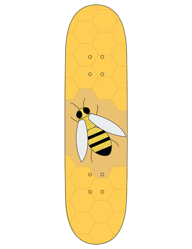
My ninth design is bee themed. I designed a bee in a bee hive, with honeycomb surrounding it. I used arial views of bees to draw it in illustrator and used honeycomb designs as well as the color scheme.
My tenth design is lemon themed. I liked how the blue looked with the lemons in the photo in my inspiration board, so I made the background color a nice blue tat would match the yellow. I drew different lemons, cut and uncut and placed them across the board and had some cut off by the end of the board.
Travel Poster
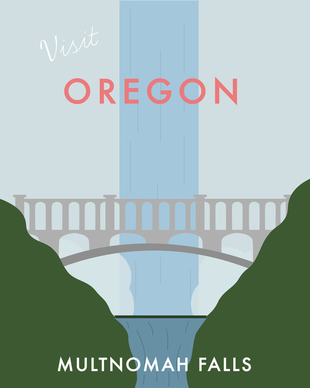
This project was to create a travel poster of a location using a famous landmark or building. Using the minimalistic style inspired by Henry Rivers. I chose Oregon and illustrated the bridge and waterfall of Multnomah Falls, Oregon
Vitamin Water Label Redesign
I redesigned the VitaminWater label and made it for 5 different flavors; mango, dragonfruit, berry, citrus and grape. I used a stock image of a water splash and edited it in photoshop to create the different colors to match the flavor. I also added 2 bars a the top and bottom to match the flavor's color.
Watch Designs
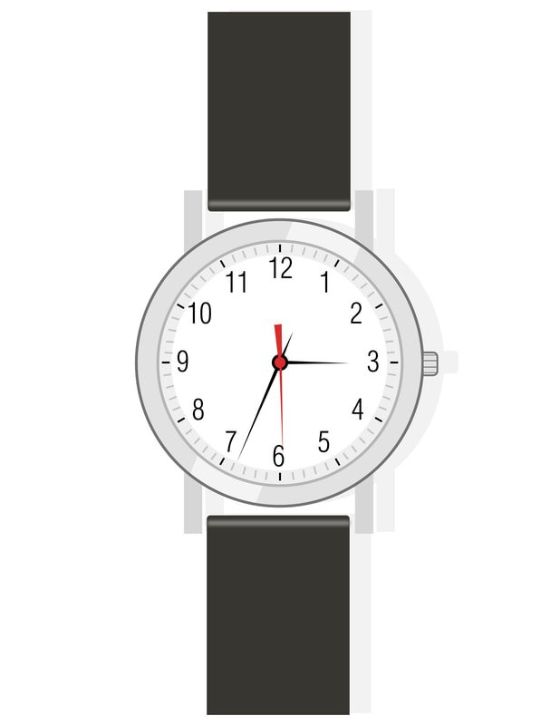
This project was about replicating a vector wrist watch design and making 4 different designs watch designs based on the original
Calendar
This project was about making a mini calendar for the year, surrounding a specific theme. I made my calendar based on flowers and having each flower represent a specific month.
Deck of Cards
This project was to design a full deck of playing cards different from already existing decks. I kept mine simple, sing black and red for the colors and having big numbers with the assigned shapes make up the shape of the number.


